What exactly is a ‘good onboarding flow’? The answer is rather subjective. A mobile app’s user onboarding flow entirely depends on who the audience is and what they want from an app. Who is to tell if the user onboarding for ‘App X’ is any better than ‘App Y’? Well, not that X, because it’s the… ehem ehem!
It doesn’t seem right to deem one onboarding design better than any other mobile app. That is why we have fashioned a list of 15 awesome mobile apps with awesome onboarding experiences.
The 15 Best Apps are:
1. Slack
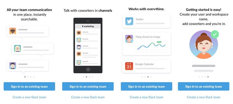
Slack has a pretty simple onboarding design. It is sweet, simple, and cuts right to the chase when launched. The mobile app is designed smartly to let users know how beneficial this app is for them – which makes sure that users want to stick to this app. Slack tells users how and why it is better than other messaging apps out there.
Users get a very fun and colorful experience when using the app. It offers a wide range of interactive guidance when setting up the app. It also allows them to be in control of how they wish to set up the app – seems like a win-win for both ends!
2. Trip.com
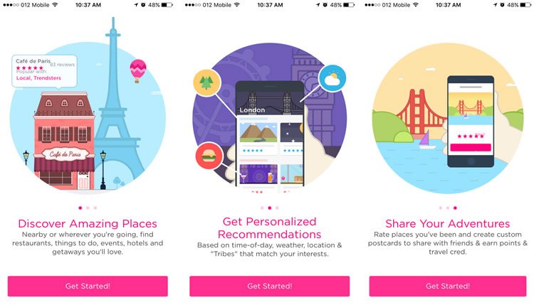
This app is nothing short of a remarkable experience for its users. That’s because of its extremely customized, colorful, and user-tailored recommendations to any activity in a set location. This is possible only because this mobile app allows users to sign up and select all the components they wish to deal with in this app.
The initial user input allows the app to show exactly what the user wants to see. Trip.com clearly tells the users why it is a great app before they sign up. This makes the user experience a form of personalization – something that will always retain a user. Trip.com offers a very attractive design – polished, bold, and easy to comprehend. The permission button makes users trust the app after they realize that the app is here to serve them. This makes the app a great hit with its users.
3. Feedly
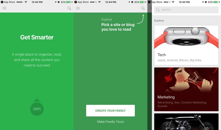
This is a road not often taken by app designers. With a slide tutorial right at the beginning, it gives a slightly different feel to its users. This mobile app uses the interactive way of familiarizing users to the app – by learning features as they go ahead and use the app.
Users land on a page that allows them to select what categories they are interested in. Auto-recommendations make it easier for users to enhance the app for themselves. This makes the app more user-friendly and user-focused. When users experience an app just the way they like it – they are bound to stick around for a while.
4. Duolingo

Duolingo mobile app commences its user onboarding with a product guide and finishes with a signup form. Gradual engagement means users are only offered to sign up when it is extremely necessary. Duolingo shows the users the benefits and gets them to sign up in order to use the features of the app.
Duolingo offers users an array of options regarding what language, duration, etc. they want to choose before they sign up. Users love this app because it simplifies using it for them before they even begin. By delaying the signup and combining it with the learning process, signing up seems like a menial task while they focus on their learning.
5. New York Times
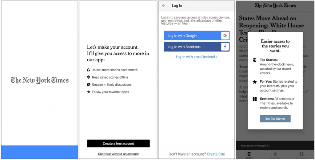
The New York Times Mobile App starts its onboarding with a simple logo of the organization, then immediately lets users know that they need to sign up to use the features of the app. The clear and crisp design of this app makes it easy for users to understand the tone set by The New York Times App.
A serious, down-to-business attitude lets users know that they will benefit from this app. Once users sign up/ login to the app, they reach the heart of the app—the news section. They get access to the top stories, and from here on they can reap the benefits of the app.
6. Fitbit
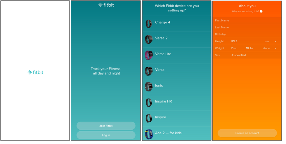
Fitbit App provides users with an extremely simple, and clear app onboarding design. It gives users a very clear choice to either sign up or login using their existing accounts if they have one. The app is very clear and provides users with a walkthrough of the app. Then, users are asked to sign up for the app or login if they are existing users.
After the signup, a basic setup of the device happens, after which they can enter details manually. The app lets users feed their personal physical information. Then they can choose a goal and the app will help them achieve it. This personalized style of onboarding makes users comfortable with the app.
7. TED Talks

The TED app is a great platform for users to gain knowledge. Which is why this app jumps straight to the point. The TED app allows users to immediately browse through the content the app has to offer. One strong point of this app is that it allows users to easily understand what button does what job.
This app also has one feature, where users can use this app freely, but then they need to signup in case they require to save a playlist or podcast. TED app users can easily discover the topics they want to hear about, listen to podcasts, or simply browse through the trending or most popular sessions on the homepage. This makes using the app easy, without extra commitment to forcefully signup for the app.
8. Audible by Amazon
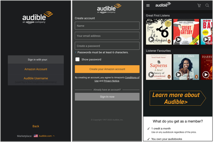
The Audible app does not take users through the app functions or the USP. The app directly jumps into giving users the option to login using their Amazon account or their Audible account. Once the users log in, the app moves on to their main message – to become a member of the app.
The onboarding design focuses on showing users what great material they can get access to. But, this is only possible if users become members of the app and use it. The app clearly shows all the benefits of the app and talks about how users can gain access to the same. A very simple, yet very demanding design for user onboarding by Audible.
9. Calm
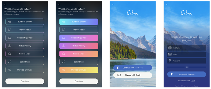
The onboarding design for the Calm app is designed to be smooth and simple. This makes user’s experiences with the app rather enjoyable. There are certain features that stand out upon using the app. Users first get a screen that asks them about why they wish to use the app. This is a great way to enlighten users about the benefits of the app.
Users can also sign up for the app without giving away too much of their personal information. This is great because it helps users feel secure with this app – due to less intrusion. Also, one benefit of this app is that it consists of cool, calming colors. This also gives users a very calming effect while using the app.
10. Cursa

The cursa app is an app that allows users to take courses free of cost. This app onboarding begins with a very basic page. It starts with a list of categories for users to choose from, or a list of top-ranking courses. Users do not have to immediately log in to gain access to the courses, but they can browse freely.
Cursa provides users the option to log in when they want to gain access to learning material, certificates, or want to set up customized lists of courses that might suit their needs. This ensures that users can make full use of the app’s features, but mainly after they create their account and use it for the app.
11. Instagram

Instagram provides users with extremely easy steps to signup for the app – using email or an existing Facebook account. While users can register with the app, they are shown a tagline ‘Sign up to see photos and videos from your friends’.
The Instagram app’s user onboarding allows users to learn what the functions of the app are. The benefits of this app are explained right from the very beginning a user gains access to this app. Instagram provides users with an in-app guide that lets them learn as they go ahead in the app. This makes it a highly addictive and easy to use app.
12. Zomato

Zomato gives users a very direct and clear message about how to use the app and its benefits. The app has a very clean onboarding design, with very clear messages describing the uses of the app. The app allows users to understand how this app will change their daily routines.
Zomato begins with users entering their locations and locating restaurants nearby. The users can then select the food items they want to order and afterward enter their address details. This makes it extremely easy for users to order food in a few minutes – making Zomato an extremely useful app.
13. Airbnb
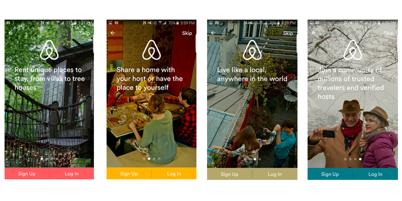
Airbnb is an app that appeals to travelers for a reason. Individuals can install the app to instantly develop a bond based on understanding. The app onboarding process immediately displays bright, meaningful images to tell the users about the emotion behind the app. The app talks about the benefits and experiences users can get from using Airbnb.
The images and colors add a very clear support to what text the app contains. The users can understand from the easy, vibrant, and seamless design what kind of features the app supports. The Airbnb app provides a signup/ login page, then leading to a page that asks users for customizable details to provide users with what they need.
14. Spotify
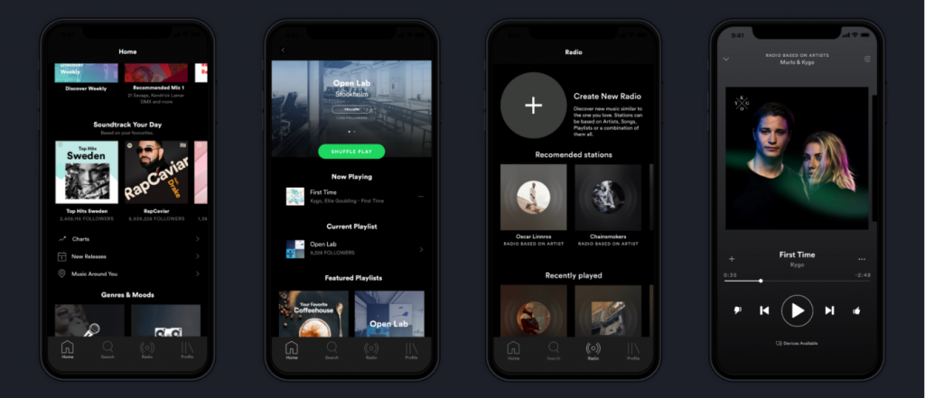
Spotify has an extremely modern, edgy, and customized app onboarding process. Users immediately realize one thing about the app – it’s free. Users are shown that they can listen to unlimited music for free, and also customize what they listen to. Spotify focuses on a rich UX to impress users and make them feel like they’re getting too much from Spotify.
This in turn also requires rich color photographs that keep users interested in the app. The app also infuses various components such as matching photographs with music moods and creating a special vibe. The app gives users a very modern and youthful vibe. This makes users feel connected and understood.
15. Pinterest
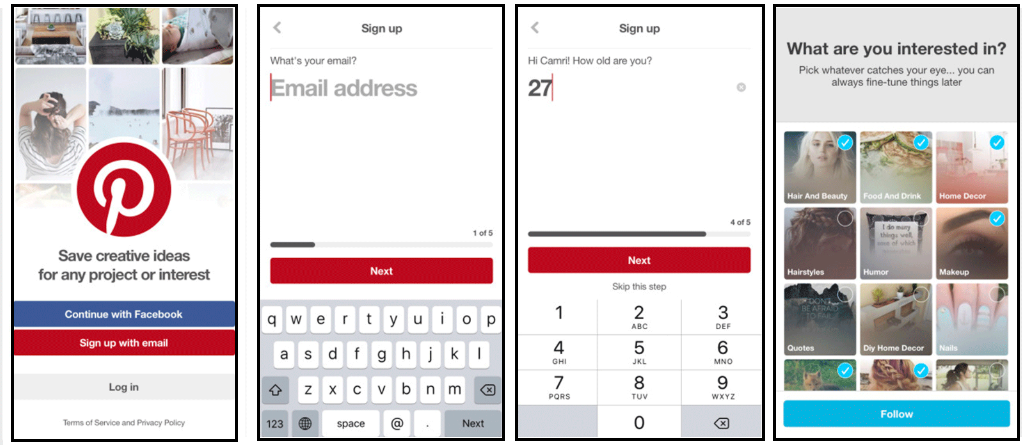
Pinterest is a great app for a cause. It allows users to enter details about them, and then pick what categories they want to see content from. Pinterest begins with a page that talks about the benefit of the app, ensuring users of a neat, easy to comprehend, and fruitful mobile app.
The neat onboarding process also makes sure that no useful info of users goes in vain. The app takes in minor details such as age, areas of interest, and much more. The app also guides users on how to use the app by simplifying the process for them. This practice by Pinterest makes it easier for users, hence making for a great app onboarding flow.
Takeaway
The app onboarding process is simple, with only one main goal – profit. But there are very minor, intricate and thought-provoking onboarding flows that get users hooked. The difference between a popular app and an average app is the onboarding flow.
No single app’s onboarding is better than another app’s onboarding. But, if an app can capture the essence of a user’s requirements then the app can succeed. There are many flows, many methods, many designs that go through a mix-n-match of ideas to capture what users want.
What do you think makes a good onboarding flow of an app? Get in touch with us and let us know!

