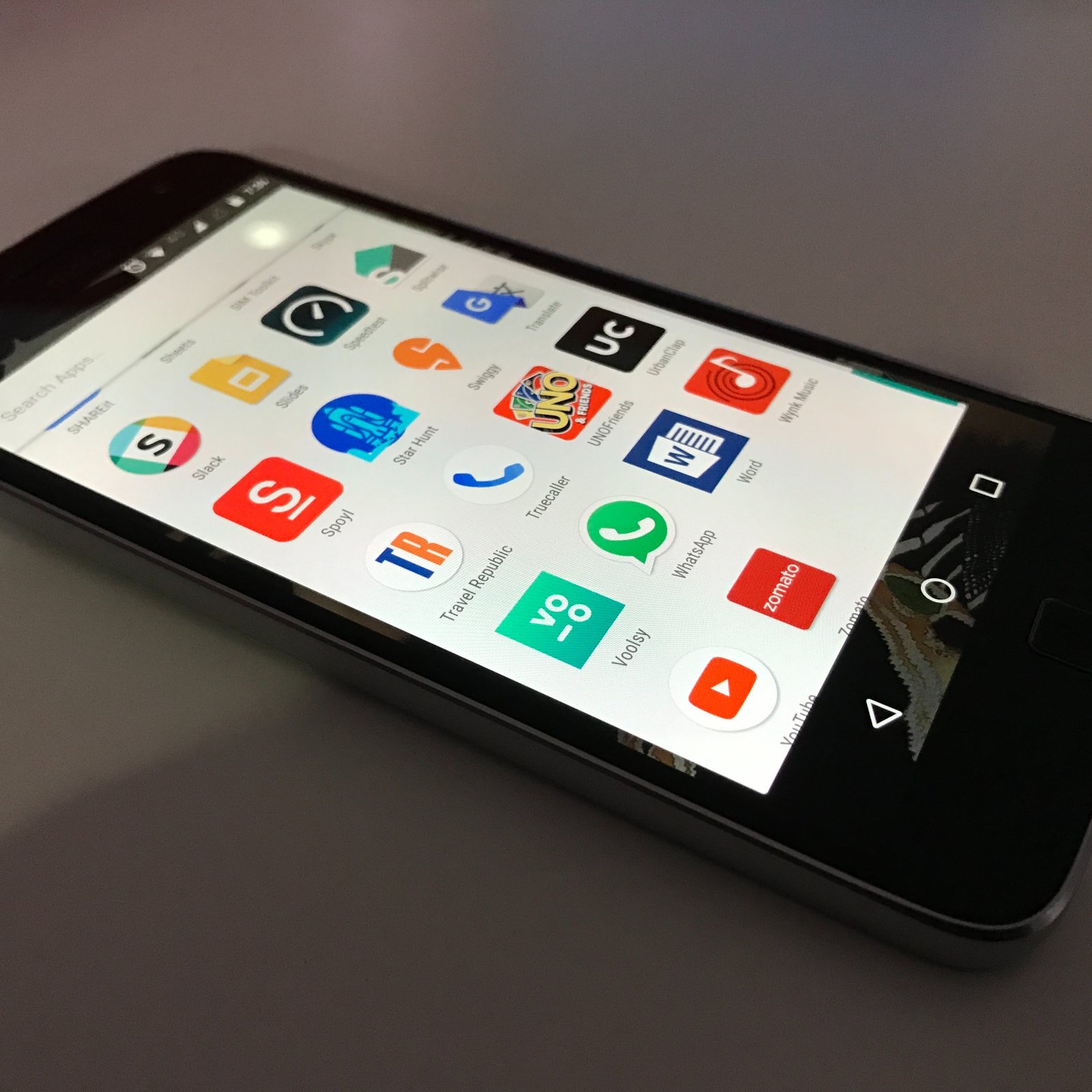
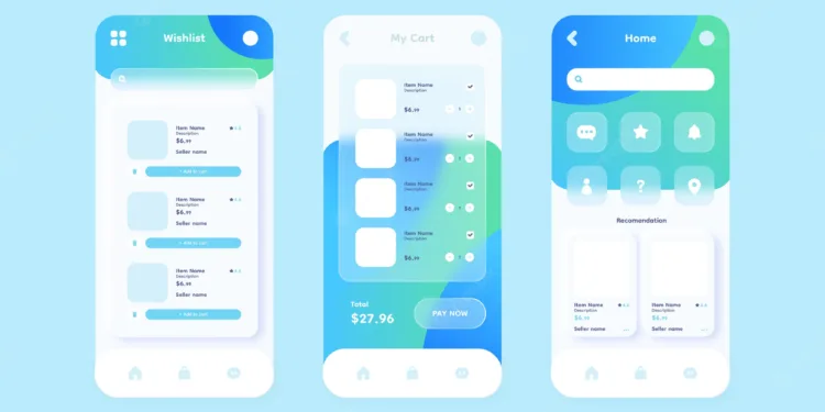
Every new app that comes out is competing for a user’s attention. With so many apps available, it’s getting harder and harder for users to find the ones they want. In order for your app to stand out from the rest, you need to know what makes an app interface design effective. A well-designed app interface can increase the conversion rate of your app and make it more discoverable among other apps users have installed.
An ineffective one would do the complete opposite. Let’s take a look at some of the best methods you can use in order to design an interface that will help your users get through their onboarding process as quickly and easily as possible;
Show your users what they need to know at the right time
One of the most important aspects of an app interface design is how you present information to your users. You want to make sure that everything you show them serves a purpose and helps them get started on the app’s features. Finding the right balance between too much and too little information is the key to an effective app interface design. Too little and your app might confuse users, too much and you risk losing them altogether.
There are a few things you can do to help you find the right balance between all the different types of information you’re showing your users. The first thing you can do is to make sure that your app interface is suitable for the device you’re designing for.
This means making sure that the type of information displayed and the size of the interface will work optimally on a smartphone’s screen. Once you make sure that you’re designing your app interface for the right device, the next thing you want to do is to pay attention to how your users interact with your app.
This can help you figure out what kind of information you should include in your interface. You’re also going to want to make sure that you’re showing your users when they need to see certain things. It’s important to know when your users want specific information.
Use an intuitive colour palette
There’s a reason why the majority of apps use blue for their colour palette. Blue is widely used across all sorts of platforms, is a calming colour and is associated with trust. That’s why you see a majority of apps use blue as their primary colour. Using a colour palette that’s well-received by your users can help you create an app interface that is more approachable and useful for them.
It can also help you create a more functional app interface that encourages your users to interact with it more. There are many ways in which you can use a colour palette in order to help you create an interface that’s more approachable and intuitive for your users.

Be transparent about where you get your data from
There are many apps that claim to be completely data-driven. You might even find some that tout that they use AI-based technologies in their marketing material. But, do you know where most of the data you see on the app comes from?
While it’s important to know how you’re combining data from different sources to create relevant and helpful algorithms and recommendations, it’s also important that you make sure that you’re transparent about how you’re doing this. If you’re not, you’re likely to get a lot of hate from users who are unhappy with how their data is being used.
Don’t make your users guess what’s going on
There’s a fine line that you need to walk in order to create an effective app interface design. On the one hand, you want to create an interface that’s intuitive for your users and easy to navigate. At the same time, you also want to create a consistent interface that will keep your users from getting lost. You might have noticed that one of the best ways to design an app interface is to show your users what they need to know at the right time.
One of the easiest ways to find this balance is to make your interface intuitive enough for your users to understand what’s going on. But, at the same time, you also want to make sure that your interface is consistent enough for your users to feel comfortable navigating.
Show your users why they should keep using your app
It’s important to consider the retention rate of your app when you’re designing an app interface. After all, if the initial engagement is low, users are more likely to uninstall your app. So, your first goal when you’re designing an app interface should be to make sure that your users stay within your app. There are many ways to accomplish this goal.
One of the best ways to do this is to keep your app interface clean and simple. It’s much easier for your users to navigate such an interface than a complicated one. At the same time, you’re also going to want to make sure that you’re incorporating the right cues into your app interface.

Conclusion
There’s no doubt that apps are an essential part of modern life. They help us get things done, stay organized, and communicate with other people. As such, it’s important to make sure that your app stands out among the rest. A great way to do this is to design your app interface with an effective method. You can do this by making sure that your app interface is intuitive, consistent, and clean. These are just a few of the best ways to design an app interface. You can also take a look at our article on How to Design a Good App Icon in order to learn even more about creating an excellent app icon!

