Main Highlights:
- Chrome is changing its logo for the first time since 2014, and with enough training, you may see the change.
- Elvin Hu, a designer at Google Chrome, offers the first glimpse at the revised logo on Twitter, along with some of the logic for the ever-so-subtle changes.
- The logo will be more colorful to match the other system icons; on macOS, the logo will have a little shadow, giving the effect of “popping out” of the dock.
- Additionally, the Chrome beta and developer versions of the logo have been updated. The most visible change is including a blueprint-style sign for the iOS beta app.
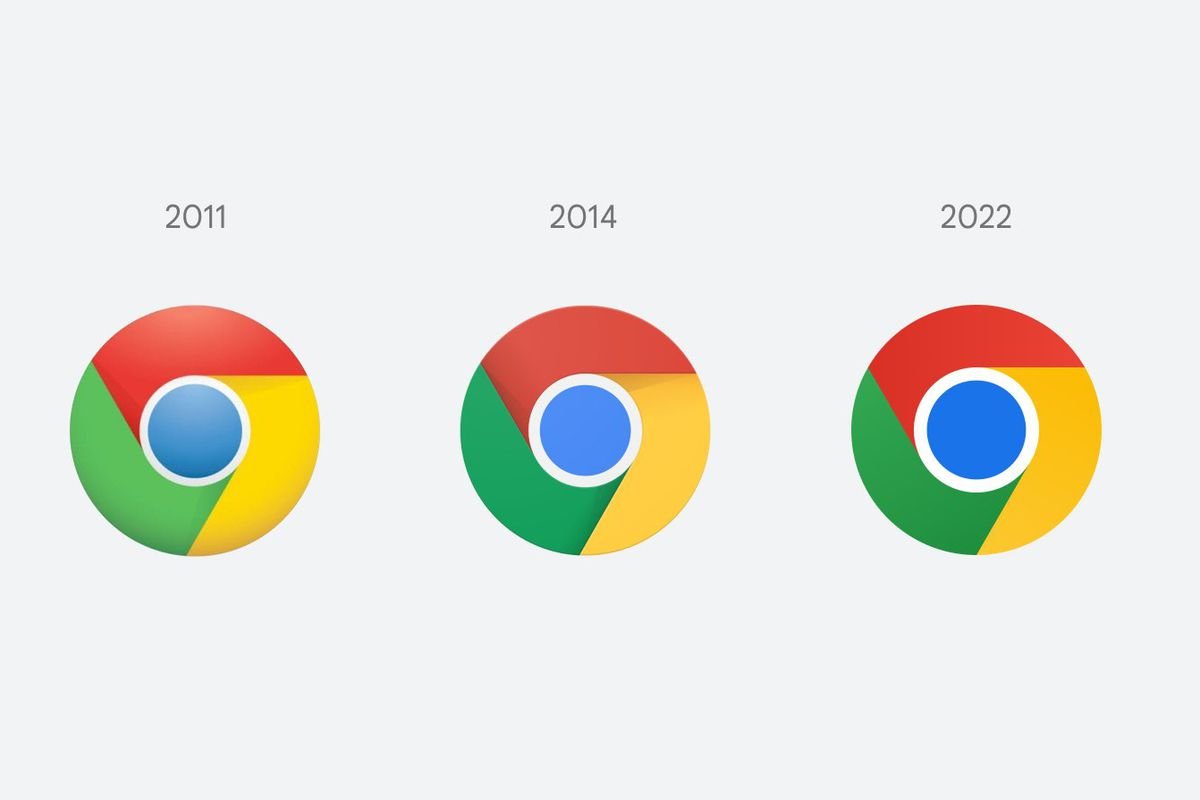
Chrome is altering its logo for the first time since 2014, and with enough squinting, you could see a difference. Elvin Hu, a Google Chrome designer, shares the first look at the redesigned logo in a post on Twitter, along with some of the reasoning for the ever-so-subtle modifications.
Instead of using shadows to “raise” the boundaries between each hue, the red, yellow, and green are flat. And while Hu does not say it, the blue circle in the center appears to be larger and penetrating your soul even more profound, but it may just be my imagination.
While the colors in the logo are more brilliant (most likely as a result of the design team eliminating the shadows), another change was found after Hu’s Twitter thread. According to reports, Google’s design staff determined that “combining specific tones of green and red caused an unpleasant color vibration.” To address this and make the symbol “more approachable,” they chose to utilize incredibly soft gradients — which the human eye cannot discern — to eliminate color vibration.
Chrome’s primary logo (the one you click from your dock/taskbar to access the web) will also vary among operating systems. The logo will be more colorful to match the other system icons; however, on macOS, the logo will have a slight shadow, creating the illusion that it is “popping out” of the dock. Meanwhile, the version for Windows 10 and 11 features a more dramatic gradient to match the aesthetic of other Windows icons. According to Hu, users of Chrome Canary (the development version of Chrome) will begin seeing the new symbol immediately. Still, it will start spreading out to the rest of the world over the following several months.
There are new icons for the Chrome beta and developer versions of the logo. The most noticeable change is adding a blueprint-style symbol for the beta app for iOS. He also writes that the design team tried with a white line separating the colors but discovered that doing so reduced the total size of the symbol, perhaps making it harder to spot among other Google apps.
Since 2008, the Chrome logo has been increasingly simplified. What began as a gleaming, three-dimensional emblem has been reduced to a two-dimensional icon of modernity. Perhaps one day, I’ll realize my desire and once again see the nearly tactile 2008 Chrome logo on my desktop—however, not today.
History, Meaning of the Chrome logo
Like other Google products, Chrome has a unique logotype highlighting several of its main characteristics. In the case of the Chrome logo, it represents the user’s online experience’s simplicity. The Google Chrome browser has maintained a solid visual identity. Since its introduction in 2008, its characteristic multicolor swirl sign has been synonymous with the browser and does not require replacement with another icon.
The browser’s 2008 logo was a three-dimensional circular form of three equal pieces and a central blue sphere. Each segment’s sides were chopped diagonally, imparting a sensation of whirling and movement, as well as a sense of speed and dynamism. The three portions were colored red, yellow, and green. Blue formed the color palette, indicating the browser’s relationship with the Google Company and demonstrating its limitless potential to its users.
In 2011, the symbol was reduced, removing the three-dimensional look and shiny surfaces. The logo went flat but retained faint shadows, which created the illusion of spinning. The central blue circle was created using gradient colors and has a matte appearance like a globe. In 2014, the logo was further simplified by omitting the blue gradient circle in favor of a solid light blue one. Its shape was changed from grey to white and widened. The outlines and shadows of the colored portions were also somewhat improved.

