In this article, you will learn everything you need to know about designing user interfaces for mobile apps. You will discover the many different elements that go into creating a successful mobile app interface and tips and tricks that can streamline your process. Keep reading if you want to know more about design principles and layouts that work best for mobile apps.
What is a good app interface?
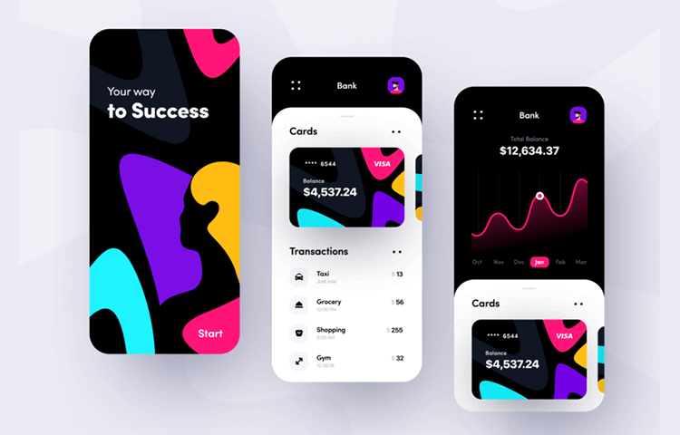
The best app interfaces are simple, beautiful, and intuitive. They are highly functional, while also being aesthetically pleasing. These are the kinds of interfaces that users remember, and they are the ones that help app developers build a strong following.
Successful mobile interfaces follow specific design conventions, but it’s important to remember that these guidelines don’t need to limit your creativity. To build the best app interfaces, start by considering your users’ needs.
What kind of information do your users need? What do they want to accomplish? This can help you define the flow of your app, and come up with an interface that makes sense. Finally, make sure that the entire interface flows together smoothly. If users have a hard time navigating certain areas of your app, they are less likely to use it.
How to create a great app interface
- Ground your designs in research. If you’re about to start designing your app’s interface, you should already have a rough idea of what you want to achieve. Doing research will help you ground your designs in authentic users’ needs and problems, and give you a better idea of how to solve them. This will also help you stay away from designing obvious solutions.
- Test your app interface on real users. As you’re designing, you’ll probably find yourself designing features and layouts that catch your eye. While these features may seem great on paper, they may not function well when you put them into practice.
- Test your app interface on actual devices. While it’s great to test your app interface on paper, you need to test it on actual devices. It’s common to design an interface that looks great on a computer screen but doesn’t function properly on an actual device.
- Separate your designs into modules. Every main section of your app (e.g. home page, sign-in page, account settings) should have its interface. If a user goes from one section of your app to another, they shouldn’t feel lost or confused.
- Build your app’s flows from top to bottom. If a certain part of your app’s interface functions well, then put it at the top of your flow. This will help your users navigate from top to bottom, and feel confident when navigating your app.

Use flat colour schemes and themes
One of the most important aspects of app development is visuals. Visuals are what help users understand how to interact with your app and click on the right parts of the interface. The right visuals can help you grow your business, create a stronger brand, and engage with customers. This can increase retention rates and make your app more valuable. Visuals can also help reduce support issues and reduce support issues by helping users understand how to use your app.
When choosing the right visuals for your app, make sure that you go with flat colour schemes. These are the most popular choices, and they are often the best ones. They don’t include too many colours, and they are easy to read.
Use the right type of button
When it comes to buttons, you want to make sure that you use the right type. This can help you stay away from common design mistakes. A standard button is a button that has an image and text on it. An icon button stays mostly hidden until it’s tapped, and it also displays an icon on the bottom. A toggle button can be turned on and off, but it doesn’t have an image and text.
Other button types include pull to open, where the button opens when a user pulls towards it, and pop to open, where the button pops up when a user pushes it. It’s best to stick to the standard button type, but other button types are fine to experiment with.

Follow visual hierarchy
Visual hierarchy is the order in which elements appear on a page, starting with the largest and moving down as the page gets narrower. In other words, visual hierarchy organizes elements into a specific order so that the main things appear at the top of the page and the secondary things appear at the bottom. Hierarchy can be used to highlight different parts of an interface. For example, if you have a list of products and they are all featured, you can use different images to visually differentiate each product.
Hierarchy can also be used to show menus. If you have a menu at the top of your page, it should be separated from the rest of the interface with a different colour or a different background image. This creates a visual hierarchy between the menu and the rest of the interface.
Include motion in your design
Motion is a part of your design that includes movement, such as scrolling, swiping, or panning. This kind of motion is useful for showing a user where they are in a certain section of your app, or where they can go next. If you’re creating an app that has a navigation menu, you should use motion to scroll or swipe the menu so that users know what they can do next.
If you don’t have any motion in your interface, users are going to be left wondering where they can go next. To incorporate motion into your designs, use parallax scrolling. This creates depth by scrolling at different speeds and is also useful for showing movement.
Don’t forget about voice controls
Voice interfaces are quickly becoming the go-to method for interacting with devices and services, and it’s even becoming a viable option for smartphone users. Voice controls extend beyond the smartphone, and they can be used on smart home devices, cars, and internet-connected appliances.
It’s important to create interfaces with voice controls in mind, especially for app interfaces. Voice controls allow your users to navigate your app without having to swipe or tap anything. Instead, they can speak their commands and have the interface respond appropriately.
To create an app interface with voice controls, you have to create a voice command. You can create voice commands using a combination of different words or phrases, and they can be in any language.

Conclusion
This article explored the many different elements that go into creating a successful mobile app interface and tips and tricks that can streamline your process. Keep reading if you want to know more about design principles and layouts that work best for mobile apps.
To design the best app interfaces, start by considering your users’ needs. What kind of information do your users need? What do they want to accomplish? This can help you define the flow of your app, and come up with an interface that makes sense. Make sure that the entire interface flows together smoothly.
If users have a hard time navigating certain areas of your app, they are less likely to use it. Ground your designs in research. If you’re about to start designing your app’s interface, you should already have a rough idea of what you want to achieve. You should be trying things out, seeing what they look like, and what they feel like. If a certain part of your interface doesn’t feel right, it’s probably not going to feel right on a device either. Test your app interface on real users.

