This guide to app onboarding is an outcome of tons of emails I get in my cattery from app publishers. ( Cattery? Yes..if you haven’t noticed… the author of this guide is a cat..that’s me..Catrano…looks like you are new here..😼 ). And all they want is to lower down their user churn to a minimum. So, we decided to write this guide that will help you adopt the best mobile app onboarding design practices. Let me know if these app onboarding tips works for you..Cheers!
With onboarding users being one of the biggest challenges a company can deal with, there are plenty of tactics to solve the issue.
This guide acts as the ultimate reference for those looking for the best onboarding practices for any mobile application. To learn more about app onboarding, keep reading!
What is Mobile App Onboarding?
Mobile App Onboarding for users is a combination of interactions and instructions that tell the user about the app. This in turn gives the user an understanding of the experience the app will deliver.
An onboarding method could be something as simple as a salutation with a basic explanation or could be more complex.
App onboarding could ask users to complete guided tasks or go through an explanation of using the app. As long as an app is successfully giving its users a guide to the benefit of the app and the products, the app onboarding is going to be a successful task.

A vast majority of users may have experienced a short series of imageries and options at the time of starting up the app for the first time. These are nothing but a few screens that tell the users how they can benefit from the said app. This puts app users at ease, giving them the satisfaction of knowing what’s next.
In some cases, apps also guide users to create accounts, edit preferences as well as adding customized lists. This is a process that allows app users to build an experience for themselves while they use this app on their terms.
The Problem with App Onboarding
Mobile apps have only one chance to make an impression on users. According to Localytics, one in four people abandon the app after the first use. So, creating that first impression on the app user is the key to retention.

This is why it is important to show users how your app can benefit users. Users generally tend to avoid trial and error when using apps. And if the “value of your app” is not communicated almost instantly then there are high chances the user will exit.
Keeping a close eye on your analytics data to check dropouts will help you in a long way and also analytics might also help you in increased revenue eventually.
This is because they don’t have time and second, they are spoilt with choices. When an app fails to pursue good onboarding practices, people tend to ditch apps faster. And once the user becomes inactive then reviving the inactive app users becomes a huge task.
This could be why UX designers tend to use designs they know have been successful earlier. This mostly creates a pool of similarly designed apps, making it tough for your app to stand out.
Therefore you should understand the different stages of onboarding methods so that you can choose the one that suits your mobile app.
The Different Stages of App Onboarding
This guide to app onboarding will touch upon the basic classification and we will soon follow up with a more detailed article to explain each type/stage of onboarding.
Pre-Boarding
Pre-Onboarding includes basic guidelines and benefits of the app. The Pre-onboarding is a visual cue of what the app will offer to users. It also lets users learn how to use the app via tutorials. The pages/ slides that appear before the app login page is the pre-onboarding section.
The pre-onboarding section of the app clarifies what the user is about to witness. These slides usually consist of slides and carousels. These slides and carousels usually work as a tutorial, easing users into the app.
Onboarding
Onboarding is the next step of pre-onboarding. The onboarding screen usually includes a login page. The user can gain access to a tutorial on how to use the app. These tutorials could be via arrows or by performing particular actions to carry commands.
This is beneficial because the app’s context is used to explain sections of the app. Features could slowly be explained to users via onboarding. Once the user understands how the app works, they can go ahead with using the app.
In-Boarding
Inboarding is the real deal! This is the phase where users experience the app by themselves. The app merely guides the users. Useful tips and clues are given to the users while they accustom themselves to the app. This creates an extremely easy way to learn about the app.
What’s the goal of App Onboarding?
There are three major goals of the Mobile App Onboarding
Greeting
Users see the onboarding screens first thing when they launch an app. This greeting screen is a virtual form of communication with the users. This form of greeting works even better when an app has a personal touch to it. In this case, mascots or special characters to communicate with users personally works best. It must be kept in mind that crisp, clear messages work best when greeting app users.
Information
Onboarding is meant to give details to the users about the app. The benefits of the product, the basic operation, and the steps to using the app must be explained clearly. Good research and a Unique Selling Point will help provide users with reasons to choose the app. Important features and problem-solving tone of the app will highlight the benefits of the app.
Engagement
The right onboarding techniques make the app desirable. When users can be engaged during onboarding using tutorials and personalization, the app can be a hit. The advantageous features of the app become easy to display if done well during onboarding. These simple steps make it easy for users to familiarize themselves with the app.
Onboarding gives users a good idea of what lays ahead in the app in terms of design, style, tone, etc of the app. If the audience develops an interest in the app format, they are more likely to come back to the app for more. This is because people are generally interested in visuals and aesthetics. Users will come back if their sense of visuals is content via the app. Users easily relate to the app (even psychologically) the moment they use and like the app.
Which are the Mobile App Onboarding Best Practices?
The mobile app onboarding practices change as user evolves. There are many factors to onboarding that a user may not get. Onboarding adaptation rates, internal objectives, product team’s strain, and legal limitations are a few challenges users fail to realize when onboarding an app.

Customers are the key to novel users for onboarding
Apps usually have only one opportunity to make a lasting impression. This is because once the user passes the biggest hurdle of downloading the app, 25% of users quit the app after the initial trial. Besides the 25% abandonment rate, over 70% of the users eventually quit using the app. This is why a brand’s first impression has to be awesome to succeed.
Once the user has downloaded the app deciding to try it out, the next step begins. The app should tell the users how they can benefit from it. This utility persuades users to keep using the mobile app. There are two kinds of users that an app can onboard.
First are users who are entirely new to the app, while second is users who may have used another version of the app (desktop, etc). App Designers must consider both users when designing the app. It must be obvious to the users (whether new or old) what the app does and how it functions. This is the core of the App Onboarding Best Practices.
It is important to keep in mind to guide new users step by step and how to use the app. One simple way to decipher users is by asking them to either login or sign up.
Designers must keep in mind that a more complex app requires thorough user onboarding, while simpler apps need only a few steps to explain the app. Apps like photo editors, management apps, etc require more steps and explanations. This could be done via pop-ups.
Creating a great user onboarding experience
The purpose of creating an app is to be of use to the audience. A good UX will deliver this message straight away. The moment a user understands “why” this app is necessary for them; they will be pleased to use this new app. The sooner the ‘AHA!’ moment arrives, the better user engagement the app has.
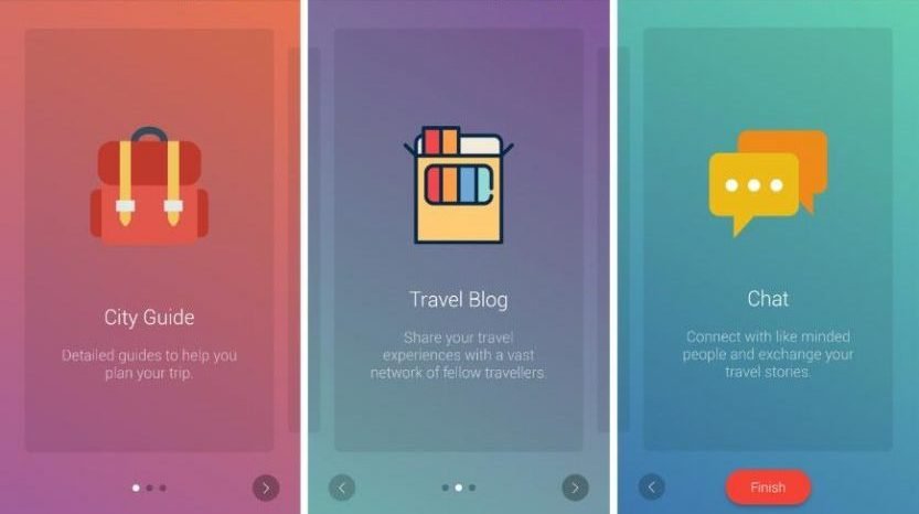
What are the different types of app onboarding?
App Tours
App tours are essential to onboarding users. Either way to show a walk-through of the app is to use videos or slideshows via multiple screens. But even UX Designers know that many users will skim past these anyways. People are impatient and tend to skip intros, yet the designer must include guides for app users.

Progress Bars and Checklists
Letting users know how far they’ve made it through the onboarding process keeps them interested. This feature gives users a sense of progress. This urges users to finish what they start – in this case, the mobile app onboarding.
Checklists provide a similar kind of motivation, giving satisfaction to finish off a list of pending tasks. People usually enjoy checking off lists, so the checklists give users a sense of accomplishment with a more comprehensive list.
Meta Onboarding
This is quite possibly the best way to gather the interest of the new users. This onboarding process teaches users to use the app via live use of the app as a game tutorial. Different apps have different functions such as swiping in a certain direction to get a task done, tapping on a color to select a feature, etc. The user learns the app by completing tasks in the app given during the Meta onboarding tutorial.
What are the different approaches to user onboarding on apps?
Since you know about onboarding and the various aspects to it, now is the time to learn about Onboarding flows. Different mobile app designs use different kinds of flows to engage users. Engaging users simply means that users will use your app repeatedly. With many onboarding flows existing, some work better than others. The best kind of mobile onboarding flows are:
- Attribute Approach
- Account Setup Approach
- Advantage Approach
- Engagement Approach
- Communicative Approach
- Merged Approach
Attribute Approach
What your app has to offer is the main focus of this onboarding flow. This enables the design to highlight what your app has in terms of functionality and what its unique features are. This flow enables designers to convey the value of the app to the users with ease.

The main job of this approach is helping users get rid of the doubts they have regarding the mobile app. When guiding users through the features, the approach allows users to immediately understand the app and its advantages.
Sign Up Approach
This onboarding flow is meant to bring in users that stay with the app. This approach concentrates on bringing users to register and set up their accounts before they start using the app. This onboarding approach works best with Social Media or Instant Messaging apps, This enables users to gain access to the app’s features – only if they sign up or setup their accounts first.
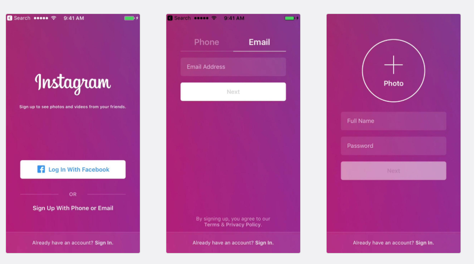
Instagram onboards users by directing them on how to set up their accounts. During user onboarding, it is also important to ask for the permission of users to allow features outside the app (camera, mic, etc.). This simple step eases the users about security breaches and makes the app more likable. When app users trust an app, retaining users becomes easy.
One thing app designers must take heed of – users hate an exhaustive number of steps to sign up for an app. So when you keep onboarding simple, the users keep coming in. The best trick to get more users is to keep signing up crisp, short, and extremely easy.
Advantage Approach
The main aim of the advantage approach is to tell users why they need the app. This approach tells users about the worth of the app for its users. To do so, the app needs to convey the USP of the app to its users and talks about why the app is great.

One way to make users value the app is by letting them know how life becomes easier with the app. Evernote app uses the advantage approach. The advantage approach is extremely beneficial for apps that require users to signup before they use the app. This is because before using the app, users can see the importance of the app (and be grateful).
Engagement Approach
The Engagement approach makes users handle the app rather than merely knowing about how the app works. This approach works best when content created by users is the main focal point of the app. This approach emboldens users to use the app and create content on it. The app Yummly is a great app to encourage action.

When users start using the app, they are convinced to interact with the app via a Call-to-Action. Users are prompted to take action and possibly customize the app based on their requirements. The app is easy for users to understand because it tells them what to do next and how to get accustomed to the app.
Communicative Approach
This is a really cool designing approach to onboard new users. This flow of approach enables the app to ‘interact’ with users in a realistic manner. Users can communicate with the app very easily, as well as be able to learn about the app.
A typical onboarding approaches work well, but the novelty of having a personalized and customized app seems even better. Users can participate in the app functionality, as well as receive special human-like interaction from apps.

Quartz is a news app that uses this form of Communicative Onboarding Approach. The app is designed similar to an Instant Messaging app. This gives users the illusion of having a regular conversation about the news.
Merged Approach
This is as easy as it sounds – a combination of multiple onboarding approaches. With a well-designed merger approach to onboarding, apps can be a hit. Apps can use interaction as well as tell the users about the features of the app.

An app could begin onboarding with a signup form, then move on to interactive onboarding designs. One such example of a merged approach to onboarding designs is the Tinder App. It uses a signup page combined with an introduction to features of the app.
Some of the best App User Onboarding examples:
1. LinkedIn
LinkedIn has one of the most classic and neatest app onboarding design strategies. As soon as the app is launched, the app delivers a very clear message about what the user can use LinkedIn for.

As soon as a user starts using the app, they can see what the application’s best features are. This familiarizes the users with what is next in the app. When users realize how clean and easy the App design is, along with its functionality easily explained – users are hooked.

Once users complete their profiles and add all the necessary information on their profiles, the app informs users that now they’re ready to use LinkedIn. This adds a human touch to the app with an encouraging message.
2. SoundCloud
SoundCloud is one of the most popular music streaming mobile apps. Once users begin using the app, they come across a basic signup/ login page. Once the user is past the process, the easy and onboarding design makes it incredibly easy for the app to retain users. Soundcloud follows a minimalist design approach which results in there awesome user experience.

Once users are past the signup/ login page, they move on to selecting music. A very easy to understand design makes it easy for users to use the app. This makes this app one of the highest used music streaming mobile application.
3. Flipboard
Flipboard is a news mobile application that allows users to have an experience similar to turning real pages. The app begins with a very clear guideline on how to use the app.

Before logging in/ signing up on the app, users get to select their matters of interest. With customizable news pieces, the user can then save these preferences by using their account for the app. This genius method makes it easy for users to become regular users of this app.
Recommended: Check out these 15 App Onboarding examples with awesome user onboarding experience.
Conclusion
The motivation behind this app onboarding guide was to help learn how to use an app in the easiest way possible to become a regular user. When users understand how and why the app is useful for them, they are likely to use it.
Users are well adapted to the app if the onboarding practice is great. Upon designing the app and testing it, UX Designers can make changes to retain users later on during the use of the app. Hope this guide to app onboarding will help you create an engaging experience for your users.
UX Designers must choose the appropriate onboarding design methods to obtain and retain users. The onboarding strategy will differ from category to category. You must check what other successful app publishers are doing in your category to devise a solid strategy.
Tool Recommendation: 10 App Onboarding Tools to help you with user app onboarding.
Recommended: 4 Mobile App Onboarding mistakes to Avoid for New App Users

